PowerBI: App Access and Manage Roles

A. Manage roles – in PowerBI desktop

  • on the report, there is a “Language Course Subject Selection” Box
  • need to set up roles so user can access report information only for certain language.
  • under the “Modeling” tab, click “Manage roles”
  • In the “Manage roles” dialog box, click “Create” button to create new roles.
  • I have created 3 roles: “ESL”, “German”, and “Universal Access”.
  • Tables section listed the all tables in the powerBI file. I have two tables in this file: data1 and lang_dimension1. data1 is the student level demographic fact data and lang_dimenstion1 is the language course information.
  • “ESL” role will filter the results for language course description for only “English as a Second Language” courses.
  • “German” role will filter the results for only German language course.
  • “Universal Access” role has no filter.
  • The “Table filter DAX expression” section can be used to define the filter(s)
  • If the filter is applied to a particular role, the filter sign will appear next to the … (more) sign of the table .
  • Click … to access more options of the roles or tables.
The examples shows configuration of the “German” role with the DAX expression on the “lang_dimension1” table subjdesc field.

B. View as Roles – in PowerBI desktop

  • under the “Modeling” tab, click “View as”
  • check “German” and OK
View as “German” role
  • The visual will only show the results for German language courses and “Language Course Subject Selection” will only have “German” listed.
  • There is also a yellow warning message appeared on the top on the visual stating “Now viewing report as: German” and click the “Stop viewing” to stop viewing the report as German role.
  • after setting up the roles and viewing the roles to make sure the roles are functional, publishing the report to the PowerBI workspace.

C. App Access – in PowerBI service

  • Be careful with creating and assigning roles to the report. As soon as you create a role in report, all the end users of the report need to be assign to a role. If no role is assigned, even you add the end users to the app, they will not able to view the powerbi visuals, and all the visuals become blank boxes with a message that you don’t have permission to the underlying dataset.
  • In the PowerBI workspace where the PowerBI report was published, go to the “Datasets” tab and click … of the report and select “Security”
  • select row-level security and add the emails of the member and save.
  • update app.

PowerBI: Analysis of MS Human Resources sample PBIX

A. Sample Dowload: https://docs.microsoft.com/en-us/power-bi/sample-human-resources

B. Report Layout (pages)

  • Info
    • Text Box
    • Image
  • New Hires
    • 4 Text Boxes (page Header, chart footer, additional instructions)
    • New Hires and Actives by Region and Ethnicity (line and Stacked column chart, Employee[actives] is a calculated field)
  • Actives and Separations
  • Bad Hires
  • New Hires Scorecard

C. Tables

D. Measures

  • Employee[Actives]= CALCULATE([EmpCount], FILTER(Employee, ISBLANK(Employee[TermDate])))
  • Employee[actives SPLY]= CALCULATE([Actives],SAMEPERIODLASTYEAR(‘Date'[Date]))
  • Employee[Active YoY % change = Divide([Actives YoY Var], [Actives SPLY])
  • Employee[Actives YoY var]= [Actives]-[Actives SPLY]

PowerBI Report Share through Workspace and PowerBI Apps

A. PowerBI Free and Pro versions

  • PowerBI free version doesn’t have the “Embed” and “Embed in SharePoint Online” options under the “File” menu. It can only publish dashboard and reports to the public. When dashboard and reports are published to the publish, the filter menu will not show in the view, so the end users can only use slicers to filter the results or interact with the dashboard/reports through cross filtering of visuals.
  • PowerBI free version cannot create Workspace, therefore not able to package reports in the Workspace into PowerBI app. You need a Pro licence to do that.
  • Only PowerBI Pro licence can view the PowerBI apps, the free version cannot.
File menu options for Free for PowerBI
File menu for Pro version of PowerBI

PowerBI and R Integration – Connect SAS dataset

Our database infrastructure is in SAS. Although many data requests can be handled directly through Base SAS, but SAS doesn’t have good visualization capability.

Directly connect PowerBI with SAS raw datasets or analytical result in SAS datasets from PowerBI through R integration can efficiently demonstrate the insights of data.

Here is the R script to connect the SAS dataset to PowerBI.

PowerBI and R Integration – Data Manipulation using R script

Reference: Power BI Introduction: Working with R Scripts in Power BI Desktop — Part 3, by Robert Sheldon.

In previous post I was focusing on using R script to develop visuals in PowerBI directly. In that case, the R scripts that are integrated with the visuals don’t generate datasets for PowerBI, and the R scripts are isolated for each visuals.

The PowerBI and R scripts can also be integrated to get and transform dataset. The caveat is the R scripts can only generate and transform one dataset at a time through Power Query Editor.

Get Data:

  • File / Home Ribbon > Get Data > More … > Other > R Script > Connect
  • The “cars” dataset appears in the “Model” view.
3 examples: cars (simple R script in Source step to GET DATA); cars_mean (R script in Source step and Run R script step); cars_co (more complex R script in Source step)
  • Click “Edit Queries” on the Home Ribbon to get into the “Power Query Editor”
  • Select “Car” from the “Queries” list
  • In the “Query Settings” the “Applied Steps” will show up in the sequece
  • To edit the original R script that gets the dataset, click the * besides the “Source” step (first step) and the “R script” box will appear. If the “Query Settings” is now showing, click “View” ribbon and “Query Settings”.
Source step in Power Query Editor for table cars.

Transform Data:

  • To create another dataset that contains the mean distance by speed group.
  • Repeat the same GET DATA steps above and name the dataset “cars_mean”
  • Get into “Power Query Editor”, select “cars_mean” table.
  • Click “Run R Script” on the “Transform” ribbon and enter the R codes that are showing below.
  • Unless in the sources step, you have to reference the dataset as “dataset” rather than the name of the table, eg “cars_mean”.
Run R script step in the Power Query Editor for table cars_mean
cars_mean table in the Data View.

More Complicated R script for Source step:

  • In the Source step, you can refer the dataset with its name. In this example, it is cars.
  • The R script needs to return a table. If the script only produce a value, you need data.frame() function to convert it to a table.
  • Make sure the required R package have been installed in the R library.
  • Use library() function to attach all the required libraries.
R script in the Source step for table cars_co in Power Query Editor
cars_co in Data View

Advanced Editor:

PowerBI and R Integration – Setup and Visualization Example

Reference: https://docs.microsoft.com/en-us/power-bi/desktop-r-visuals

Notes for setup:

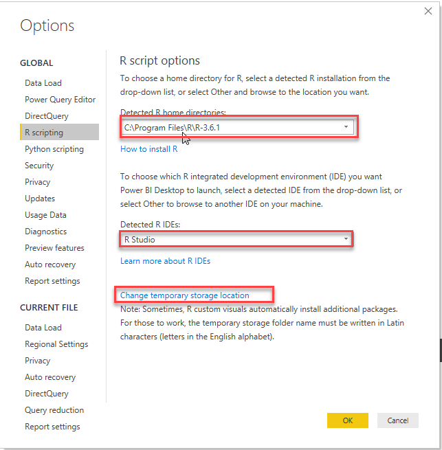
  • In PowerBI: File -> Options and Settings -> Options -> R scripting
  • The libraries required to run R visuals in PowerBI needs to be installed in the R library. The R codes in PowerBI can’t process install.packages(” “) function.
  • Go to c:\program Files\R\R-x.x.x\library folder to check if you already have the required R package installed.
  • In the Options for “R scripting”, click “Change temporary storage location” to point to c:\program Files\R\R-x.x.x\library folder.
Set up R in PowerBI

Note for the PowerBI and R Integration Example:

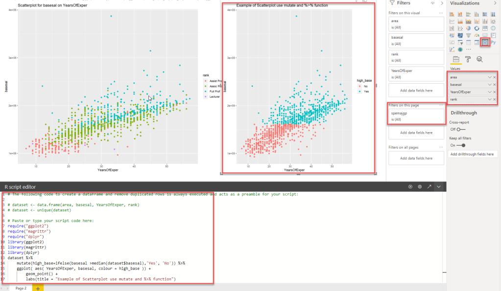
  • Use “Get Data” to get raw dataset into PoweBI, then the variables will show up in the “Fields” panel.
  • Click “R” in the “Visualizations” panel, then a grey visual placeholder will show up in the body section of the page and the “R script editor” will show up at the bottom of the page.
  • Drag or select variables in the “Fields” panel, the variables will be added to the “Values” section on the “Visualizations” panel, and the variables will be automatically incorporated in a dataframe called “dataset”. You don’t need to do additional code to create the dataframe, and don’t remove the “#” sign from line 1 to line 7 of the code.
  • Starting on line 7, create your own r script.
  • Start with require(” “) and library() to attached the required packaged for this R visual.
  • Filters are interactive with the R visual.
  • Multiple R visuals can be created on the same page and each visual has its own R codes.

Data Visualization – Sankey Diagram in PowerBI

I did the sankey diagram in PowerBI a while ago for a faculty data request regarding students flow into and out of selected interdisciplinary majors.
Both PowerBI and Tableau have apps for building sankey diagram, but personally I think sankey app for PowerBI is more user friendly.
Here is the link to the mock-up Sankey diagram for a fake program. You can filter by major, entry status, year level and you can build more programs and cohorts to it.
Sankey Example

Heuristic Andrew

Good-enough solutions for an imperfect world

Social Media Oreo

Social Media Oreo

Real Data

Adventures in Data Science

A. C. Cockerill

Past to Future in a Picosecond

Social Mathematics

The interaction between Mathematics and the modern day world.

PH Bytes

Code is the New Literacy

Data Science Insights

In Pursuit of Smarter Decisions for Performance